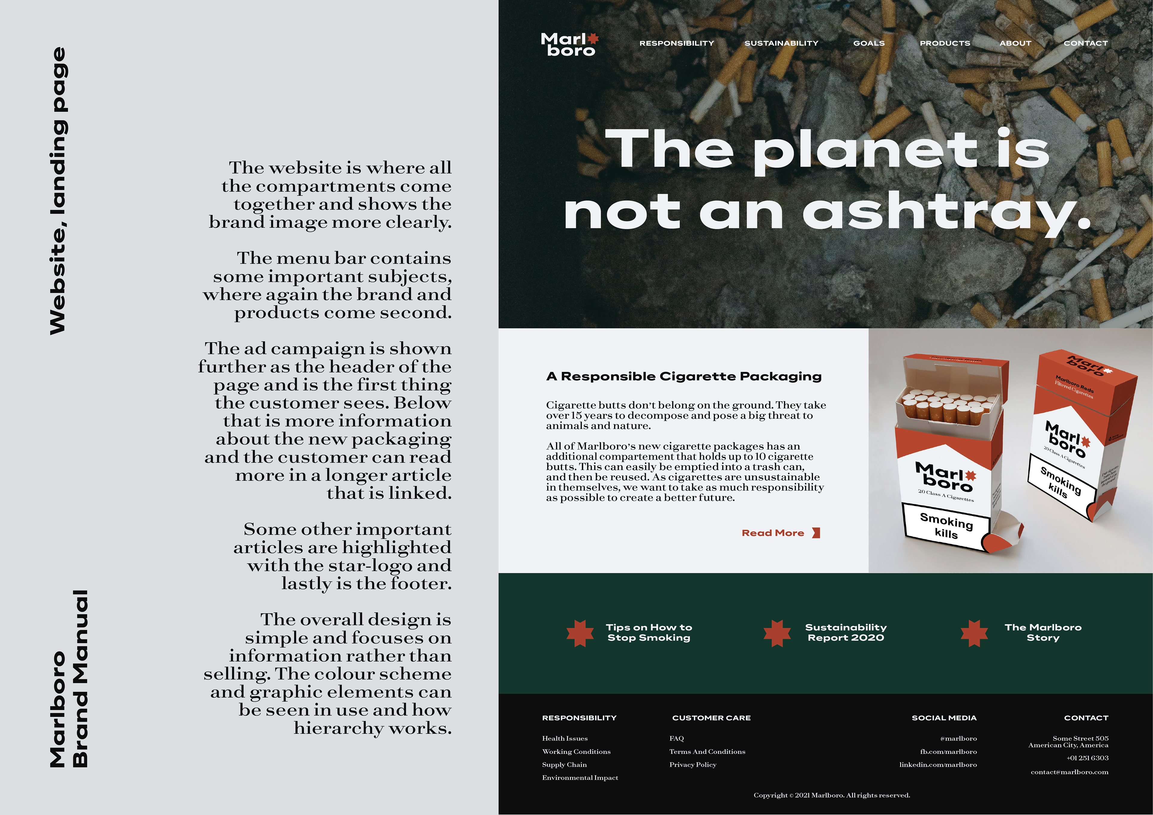
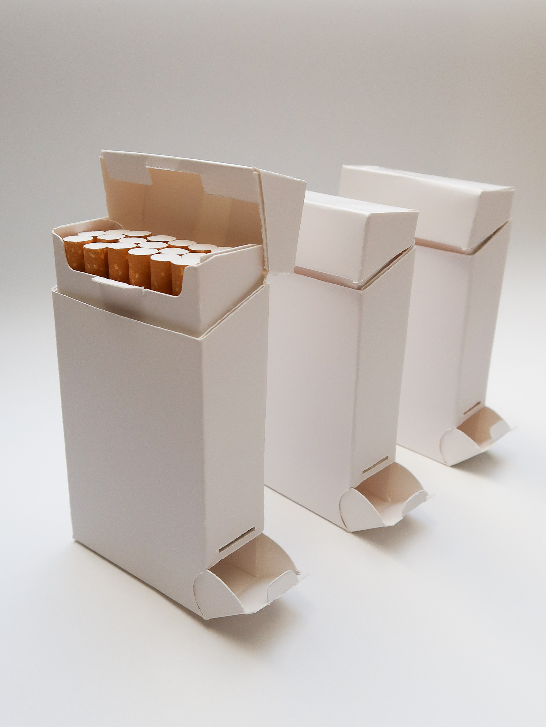
During a course called Sustainable Perspective in Graphic Design at Linneaus University, I decided to extend my bachelor's thesis and rebrand Marlboro. The assignment was to choose an existing brand and develop it into a more sustainable brand and redesign the visual identity. As I apparently like to make things more difficult for myself than needed, I choose a brand that is very unsustainable and would then try to rebrand it sustainably, without falling into the traps of greenwashing.
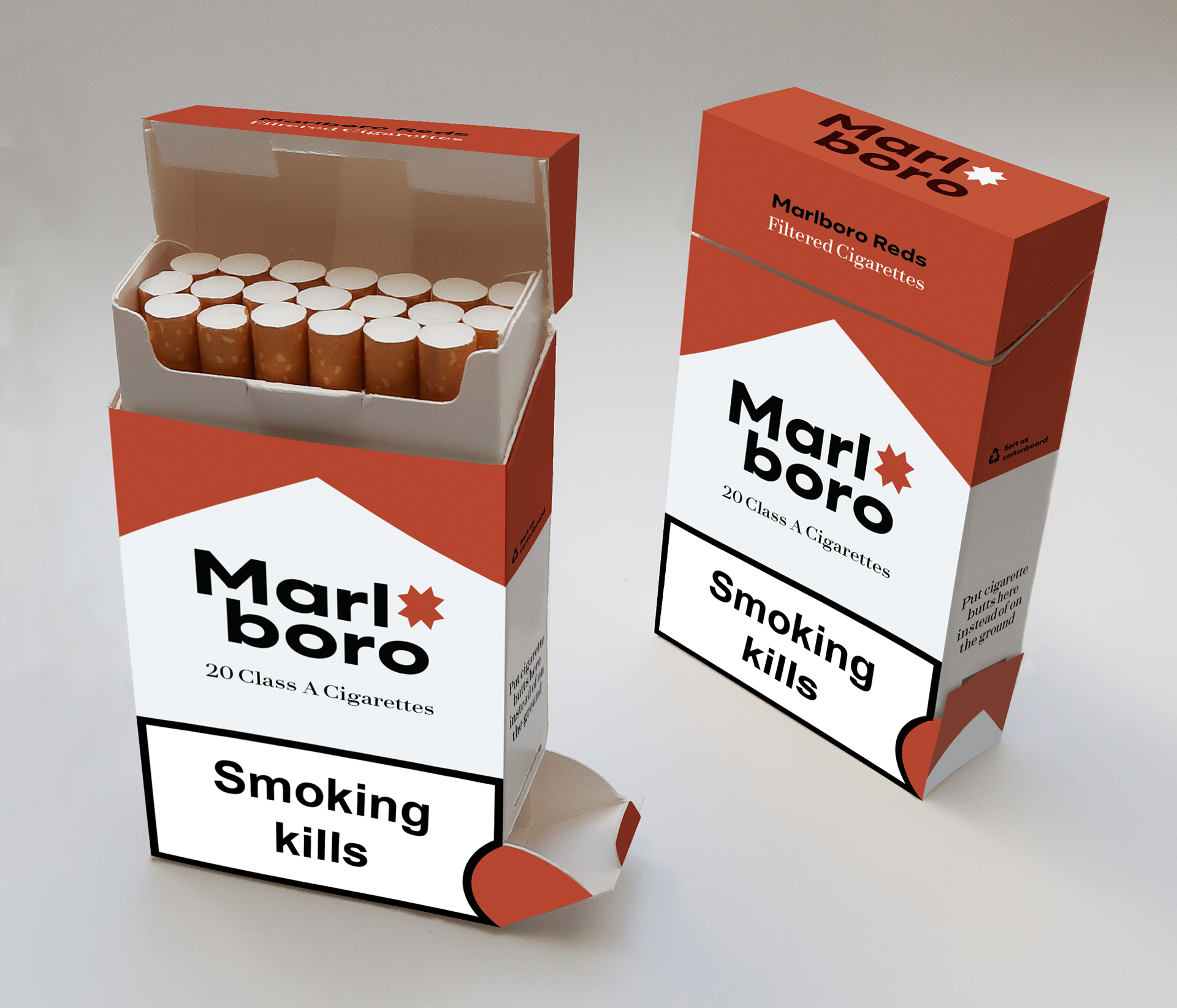
My approach was to scratch the founding idea of Marlboro, scratch the "ideal" Marlboro Man and everything he stands for, and start new with a more progressive and open mindset. The design needed to take off in the existing branding and still be recognizable, but have a new logotype and general identity. A difference in communication, brand vision and mission were a key part that needed to be changed. A brand that creates environmentally harmful products that are also a big health risk, can't pop up out of nowhere in a new identity claiming to be sustainable without doing an actual change. A brand like Marlboro can't ever be fully sustainable unless they close all their production and seize to exist, which therefore became my underlying goal in the rebrand. I didn't want it to attract new customers, but to make the existing ones question their behavior and hopefully stop smoking overall.
The brand manual including logotype, typefaces, colors, packaging design, marketing material etc can be seen below that explains the process and designs more in depth.